Responsive Ecommerce Website Design and Development
Think about how people shop today. They discover a product on a phone while travelling, compare prices on a tablet in the evening and complete the order on a laptop at work. Some buy straight from their phone in a single minute. If your online store looks broken, loads slowly or is hard to use on any one of these devices, you lose the sale, and often the customer for good.
Responsive ecommerce website design and development solves this problem. It builds your store so that layouts, images, menus and checkout adjust smoothly to every screen size. Zentrix Infotech, a web and ecommerce development company based in Moradabad, builds responsive online stores that give shoppers the same easy, trustworthy experience on every device.
What Is a Responsive Ecommerce Website?
A responsive ecommerce website automatically adapts its layout and content to the screen it is viewed on. A single store works well on a small phone, a large tablet, a laptop and a wide desktop monitor, without needing separate versions.
In a well-built responsive store:
- Menus turn into simple, thumb-friendly navigation on phones
- Product images resize and load fast without losing quality
- Text stays readable without pinching or zooming
- Buttons are large enough to tap easily
- Filters and sorting options remain easy to use on small screens
- Checkout forms are short and friendly on touch devices
- The whole store loads quickly even on slower mobile networks
Why Responsive Design Matters for Online Stores
Most Shoppers Use Mobile Phones
In India, a large share of online browsing and buying happens on smartphones. A store that is not designed for mobile first is ignoring most of its audience.
Better Conversion Rates
When shopping feels easy, more visitors become buyers. Smooth mobile navigation, clear product pages and quick checkout reduce drop-offs and abandoned carts.
Stronger Search Visibility
Google evaluates the mobile experience of websites when ranking them. A fast, responsive store is far more likely to perform well in search results.
One Site, Lower Cost
A single responsive store is cheaper to build and maintain than separate desktop and mobile websites, and your content stays consistent everywhere.
Greater Trust
A clean, working store on every device signals professionalism. Shoppers trust brands that look reliable, especially when they cannot touch the product.
Future Readiness
New devices and screen sizes keep appearing. A flexible responsive design adapts to them without a complete rebuild.
About Zentrix Infotech
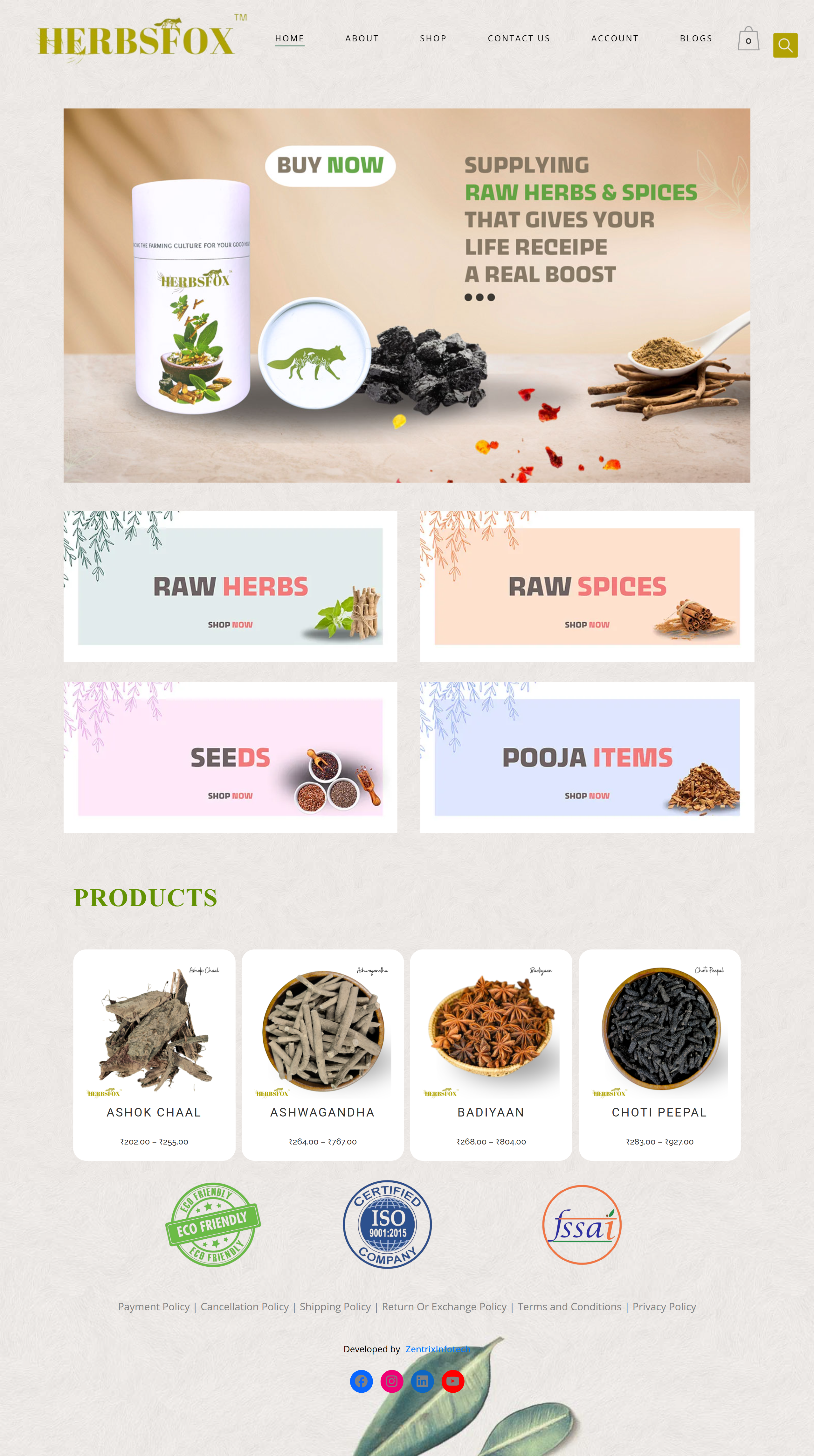
Zentrix Infotech is a full-service IT company offering web development, UI/UX design, custom software, mobile apps, cloud solutions and digital marketing. We have completed more than 250 projects for over 270 clients and hold a 4.7 out of 5 client rating. Our portfolio includes online retail and marketplace platforms such as The Buyzaar Mart, Herbsfox and Southern Palate, along with websites for interior studios, hospitals, institutions and handicraft businesses.
Design, development and marketing work together under one roof, so your store is built to look good, run fast and bring in visitors from the very start.
Our Responsive Ecommerce Services
Mobile-First UI and UX Design
We begin each design on the smallest screen and expand upward. This keeps the most important actions, such as search, add to cart and checkout, simple and easy to reach with a thumb.
Responsive Ecommerce Development
Our developers build flexible layouts using modern front-end practices so your store adapts smoothly across devices. We work with Shopify, WooCommerce, Magento, WordPress and custom stacks such as React, Next.js, Laravel and MERN.
Responsive Product and Category Pages
We design product pages with swipeable image galleries, clear variant selectors, readable specifications and sticky add-to-cart buttons. Category pages use smart grids and easy filters that work well on small screens.
Responsive Cart and Checkout
We create short, clear checkout flows with guest checkout, auto-filled details, trusted payment icons and mobile-friendly payment options including UPI, cards, net banking and wallets.
Speed and Performance Optimization
Speed is a core part of responsive design. We compress images, load content smartly, reduce unnecessary code and use caching and cloud hosting so pages load quickly even on slower networks.
Progressive Web App Options
For stores that want an app-like experience without a full mobile app, we can build progressive web app features such as fast loading and home screen access.
Mobile App Development
When you are ready for a dedicated shopping app, we build Android and iOS apps connected to your store for loyal, repeat customers.
Responsive Redesign of Existing Stores
If your current store looks poor on phones, we can redesign it, improve usability and protect your existing search rankings during the update.
Testing Across Devices
We test your store on real phones, tablets and desktops, and across common browsers, so problems are found and fixed before your customers see them.
Our Design and Development Process
- Discovery: we learn about your business, products, customers and goals.
- Device and audience research: we study how your customers shop and which devices they use.
- Wireframes: we plan page layouts for mobile, tablet and desktop.
- Visual design: we create the look and feel with a focus on clarity and conversion.
- Development: we build the store with flexible layouts, fast code and secure payments.
- Testing: we check layouts, speed, forms and payments on multiple devices and browsers.
- Launch: we take your store live and set up tracking and search visibility.
- Improvement: we review real user data and refine the experience over time.
Features That Make a Store Truly Responsive
- Flexible grids and images that scale to any screen
- Touch-friendly buttons, menus and filters
- Fast loading with optimized images and clean code
- Sticky add-to-cart and easy cart access
- Simple search with suggestions
- Short checkout forms with clear error messages
- Readable fonts and good colour contrast
- Click-to-call and WhatsApp support buttons
- Search-friendly structure with proper titles, descriptions and schema
- Secure hosting with SSL and regular backups
Common Responsive Design Mistakes to Avoid
- Shrinking the desktop design instead of designing mobile-first
- Using heavy images that slow down mobile pages
- Tiny buttons and links that are hard to tap
- Pop-ups that cover the screen on phones
- Long, complicated checkout forms
- Hidden or confusing navigation
- Skipping real device testing
Avoiding these mistakes can noticeably improve both customer experience and sales.
Industries We Serve
Our responsive ecommerce work covers handicraft and metalware exporters, home decor and lifestyle brands, jewellery and fashion sellers, herbs, spices and wellness brands, wholesalers and distributors, retail franchises, and educational or service businesses selling online.
Why Choose Zentrix Infotech
- Mobile-first mindset: we design for the screen your customers use most
- Complete service: design, development, integration and marketing from one team
- Proven ecommerce experience: stores for retail, wellness, spice and handicraft brands
- Performance focus: speed, usability and conversion, not only appearance
- Clear pricing: transparent quotes with defined deliverables
- Local support: our Moradabad office makes communication easy
- Long-term partnership: updates and improvements after launch
Contact Zentrix Infotech
Ready to give your customers a great shopping experience on every device? Talk to our team for a free consultation and a clear project quote.
Address: 12/11, Buddhi Vihar Phase 2, Moradabad, Uttar Pradesh 244001
Phone: +91 72488 00839
Email: info@zentrixinfotech.com
Frequently Asked Questions
1. What is a responsive ecommerce website?
It is an online store that automatically adjusts its layout to look and work well on phones, tablets and desktops.
2. Why is responsive design important for ecommerce?
Most shoppers use phones, and a smooth experience improves sales, trust and search visibility.
3. What is the difference between responsive and mobile-first design?
Mobile-first starts the design on the small screen and scales up, which keeps the mobile experience strong.
4. How much does a responsive ecommerce website cost?
Cost depends on features and platform. Contact Zentrix Infotech for a free, clear quote.
5. How long does development take?
Most stores take about four to eight weeks, depending on features and size.
6. Can you make my existing store responsive?
Yes. We redesign and improve your store while protecting your current search rankings.
7. Which platforms do you build on?
We build on Shopify, WooCommerce, Magento, WordPress and custom stacks such as React, Next.js, Laravel and MERN.
8. Do you offer support after launch?
Yes. We provide maintenance, updates, testing and improvements after your store goes live.
📞 Call: +91 72488 00839
📧 Email: info@zentrixinfotech.com
🌐 Website: www.zentrixinfotech.com
Related Pages in Moradabad